30 JCF: Fire
The 30th edition of the Jewish Culture Festival continued the element-themed cycle started in the previous edition. This time, the focus was on FIRE.
30 JCF: Fire
The 30th edition of the Jewish Culture Festival continued the element-themed cycle started in the previous edition. This time, the focus was on FIRE.
30 JCF: Fire
The 30th edition of the Jewish Culture Festival continued the element-themed cycle started in the previous edition. This time, the focus was on FIRE.


Visual identity of the festival:
Assumptions
Research, trends
Style and tone
Visual identity
Logo
Key visual
Graphic elements
Illustrations
Motion design
Implementation
Venue signage
Animations
Festival prints
Posters, banners
Social media communication framework
Material selection, technical preparation
Website
Web design
Front-end development
Back-end development
System integration
Visual identity of the festival:
Assumptions
Research, trends
Style and tone
Visual identity
Logo
Key visual
Graphic elements
Illustrations
Motion design
Implementation
Venue signage
Animations
Festival prints
Posters, banners
Social media communication framework
Material selection, technical preparation
Website
Web design
Front-end development
Back-end development
System integration
Visual identity of the festival:
Assumptions
+
Visual identity
+
Implementation
+
Website
+
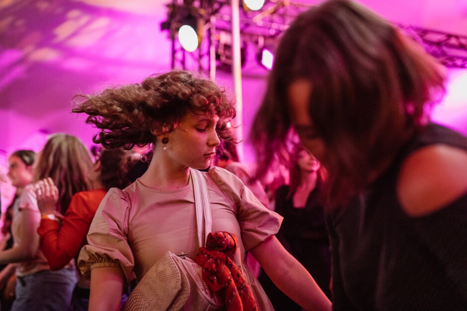
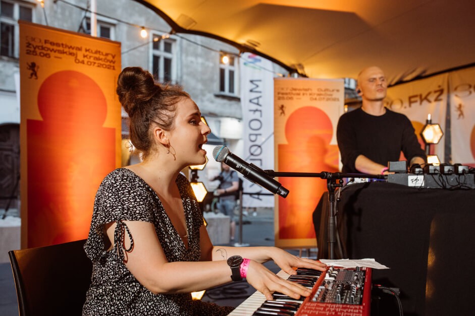
To the usual copper-gold color, we added a psychodelically iridescent combination of pink and orange, which was used in prints, social media, and outdoor lighting through appropriately chosen illumination.
To the usual copper-gold color, we added a psychodelically iridescent combination of pink and orange, which was used in prints, social media, and outdoor lighting through appropriately chosen illumination.
To the usual copper-gold color, we added a psychodelically iridescent combination of pink and orange, which was used in prints, social media, and outdoor lighting through appropriately chosen illumination.

This time, the usual catalog was replaced with a program in the form of a foldable poster featuring the event schedule on the front, further boosting the festival’s presence in the urban space.
This time, the usual catalog was replaced with a program in the form of a foldable poster featuring the event schedule on the front, further boosting the festival’s presence in the urban space.
This time, the usual catalog was replaced with a program in the form of a foldable poster featuring the event schedule on the front, further boosting the festival’s presence in the urban space.


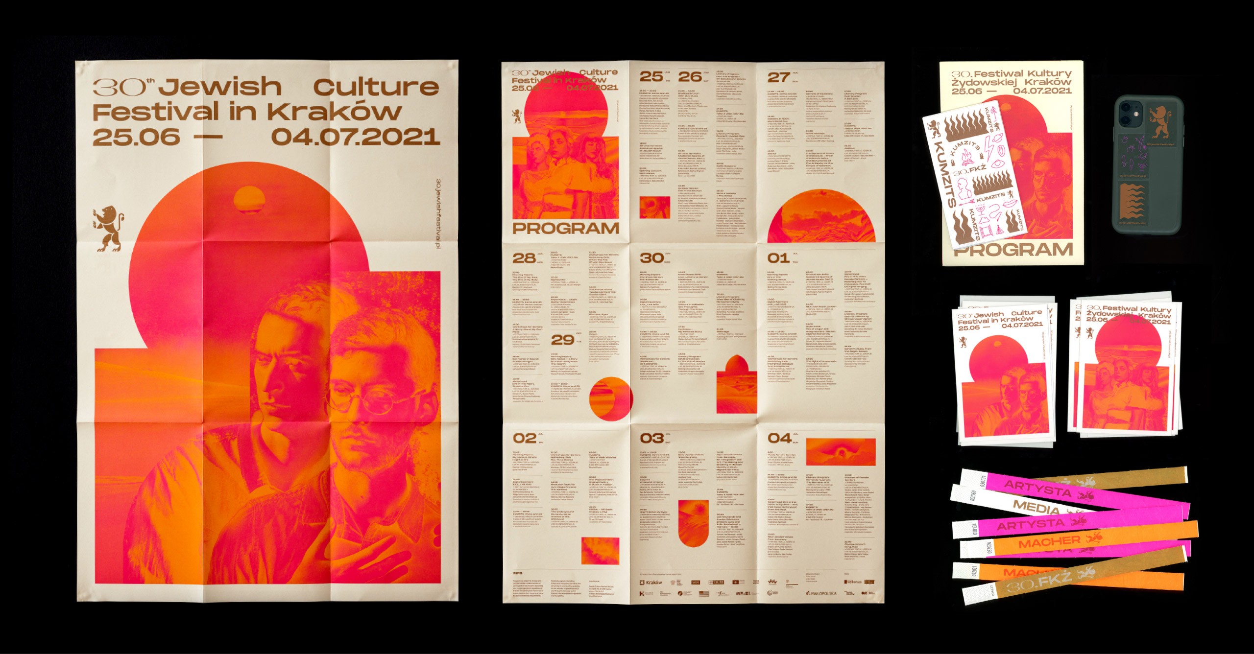
In addition to hot desert landscapes and artist photos, we also used characteristic shapes loosely drawn from synagogue architecture.
In addition to hot desert landscapes and artist photos, we also used characteristic shapes loosely drawn from synagogue architecture.
In addition to hot desert landscapes and artist photos, we also used characteristic shapes loosely drawn from synagogue architecture.




As in the previous edition dedicated to earth, this year the shirts for the volunteers – or machers – were made using the tie-dye technique in collaboration with the festival team, continuing the elemental theme.
As in the previous edition dedicated to earth, this year the shirts for the volunteers – or machers – were made using the tie-dye technique in collaboration with the festival team, continuing the elemental theme.
As in the previous edition dedicated to earth, this year the shirts for the volunteers – or machers – were made using the tie-dye technique in collaboration with the festival team, continuing the elemental theme.


The event also expanded to include a new and significant part of the program – the artistic project KUMZITS, which we designed with its own distinct identity while fitting within the current festival’s visual identity.
The event also expanded to include a new and significant part of the program – the artistic project KUMZITS, which we designed with its own distinct identity while fitting within the current festival’s visual identity.
The event also expanded to include a new and significant part of the program – the artistic project KUMZITS, which we designed with its own distinct identity while fitting within the current festival’s visual identity.


The festival program was also accessible through an app and a dedicated website to this years’ edition of the festival.
The festival program was also accessible through an app and a dedicated website to this years’ edition of the festival.
The festival program was also accessible through an app and a dedicated website to this years’ edition of the festival.


2021
Design team:
Tomasz Jurecki, Oksana Shmygol, Julek Wierzchowski, Maciek Mach, Jan Drozd, Piotr Baran, Mirek Kliś
2021
Design team:
Tomasz Jurecki, Oksana Shmygol, Julek Wierzchowski, Maciek Mach, Jan Drozd, Piotr Baran, Mirek Kliś
2021
Design team:
Tomasz Jurecki, Oksana Shmygol, Julek Wierzchowski, Maciek Mach, Jan Drozd, Piotr Baran, Mirek Kliś

Let's talk about cooperation
© 2026 × studio otwarte
Let's talk about cooperation
© 2026 × studio otwarte
Let's talk about cooperation
© 2026 × studio otwarte