A theater for all
Ludowy was established in the 1950s and is one of the most important theatrical stages in Krakow. In 2023, it expanded its activities by creating the Theatrical Institute for Youth. Changes within the institution necessitated a new visual language.
A theater for all
Ludowy was established in the 1950s and is one of the most important theatrical stages in Krakow. In 2023, it expanded its activities by creating the Theatrical Institute for Youth. Changes within the institution necessitated a new visual language.
A theater for all
Ludowy was established in the 1950s and is one of the most important theatrical stages in Krakow. In 2023, it expanded its activities by creating the Theatrical Institute for Youth. Changes within the institution necessitated a new visual language.


Theater rebranding:
Brand strategy
Current brand status diagnosis
Brand architecture
Research, trends
Style, tone
Visual identity
Font
Logo and identification system
Key visual
Graphic elements
Icons and infographics
Motion design
Signage, wayfinding
Analalysis and audit of the space
Spatial communication concept
Design concept
Project concept
Complete set of rules and technical designs for placement
Supervision of implementation
Research, testing, quality control
Implementation
Communication design templates
Print templates
Material selection, technical preparation
Design system
Brand manual
Theater rebranding:
Brand strategy
Current brand status diagnosis
Brand architecture
Research, trends
Style, tone
Visual identity
Font
Logo and identification system
Key visual
Graphic elements
Icons and infographics
Motion design
Signage, wayfinding
Analalysis and audit of the space
Spatial communication concept
Design concept
Project concept
Complete set of rules and technical designs for placement
Supervision of implementation
Research, testing, quality control
Implementation
Communication design templates
Print templates
Material selection, technical preparation
Design system
Brand manual
Theater rebranding:
Brand strategy
+
Visual identity
+
Signage, wayfinding
+
Implementation
+
Teatr Ludowy is closely associated with Nowa Huta and the local community, but its repertoire is aimed at audiences from all over Poland. It offers spectacles for children, youth, and adult viewers. The theater presents avant-garde performances that set new directions in Polish theater, as well as more popular and mainstream productions
Teatr Ludowy is closely associated with Nowa Huta and the local community, but its repertoire is aimed at audiences from all over Poland. It offers spectacles for children, youth, and adult viewers. The theater presents avant-garde performances that set new directions in Polish theater, as well as more popular and mainstream productions
Teatr Ludowy is closely associated with Nowa Huta and the local community, but its repertoire is aimed at audiences from all over Poland. It offers spectacles for children, youth, and adult viewers. The theater presents avant-garde performances that set new directions in Polish theater, as well as more popular and mainstream productions


We started the creative process with the visual history of the theater. Old logos, posters, and flyers were analyzed, and the architecture of the theater’s building was closely examined. This research aimed to find inspiration for the new branding.
We started the creative process with the visual history of the theater. Old logos, posters, and flyers were analyzed, and the architecture of the theater’s building was closely examined. This research aimed to find inspiration for the new branding.
We started the creative process with the visual history of the theater. Old logos, posters, and flyers were analyzed, and the architecture of the theater’s building was closely examined. This research aimed to find inspiration for the new branding.

Of course, we couldn’t overlook the beautiful neon sign on the front facade. It was the basis of the typeface we created and called “Ludowy.” Initially, we only designed it for a few letters needed for the logo. Over time, it evolved into a complete font which we used as the key visual for the institution.
Of course, we couldn’t overlook the beautiful neon sign on the front facade. It was the basis of the typeface we created and called “Ludowy.” Initially, we only designed it for a few letters needed for the logo. Over time, it evolved into a complete font which we used as the key visual for the institution.
Of course, we couldn’t overlook the beautiful neon sign on the front facade. It was the basis of the typeface we created and called “Ludowy.” Initially, we only designed it for a few letters needed for the logo. Over time, it evolved into a complete font which we used as the key visual for the institution.


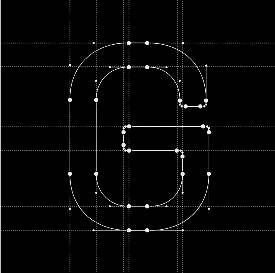


“Ludowy” is a variable font with adjustable character widths that we developed. In addition to posters and prints, it works great in animations and digital promotional materials.
“Ludowy” is a variable font with adjustable character widths that we developed. In addition to posters and prints, it works great in animations and digital promotional materials.
“Ludowy” is a variable font with adjustable character widths that we developed. In addition to posters and prints, it works great in animations and digital promotional materials.

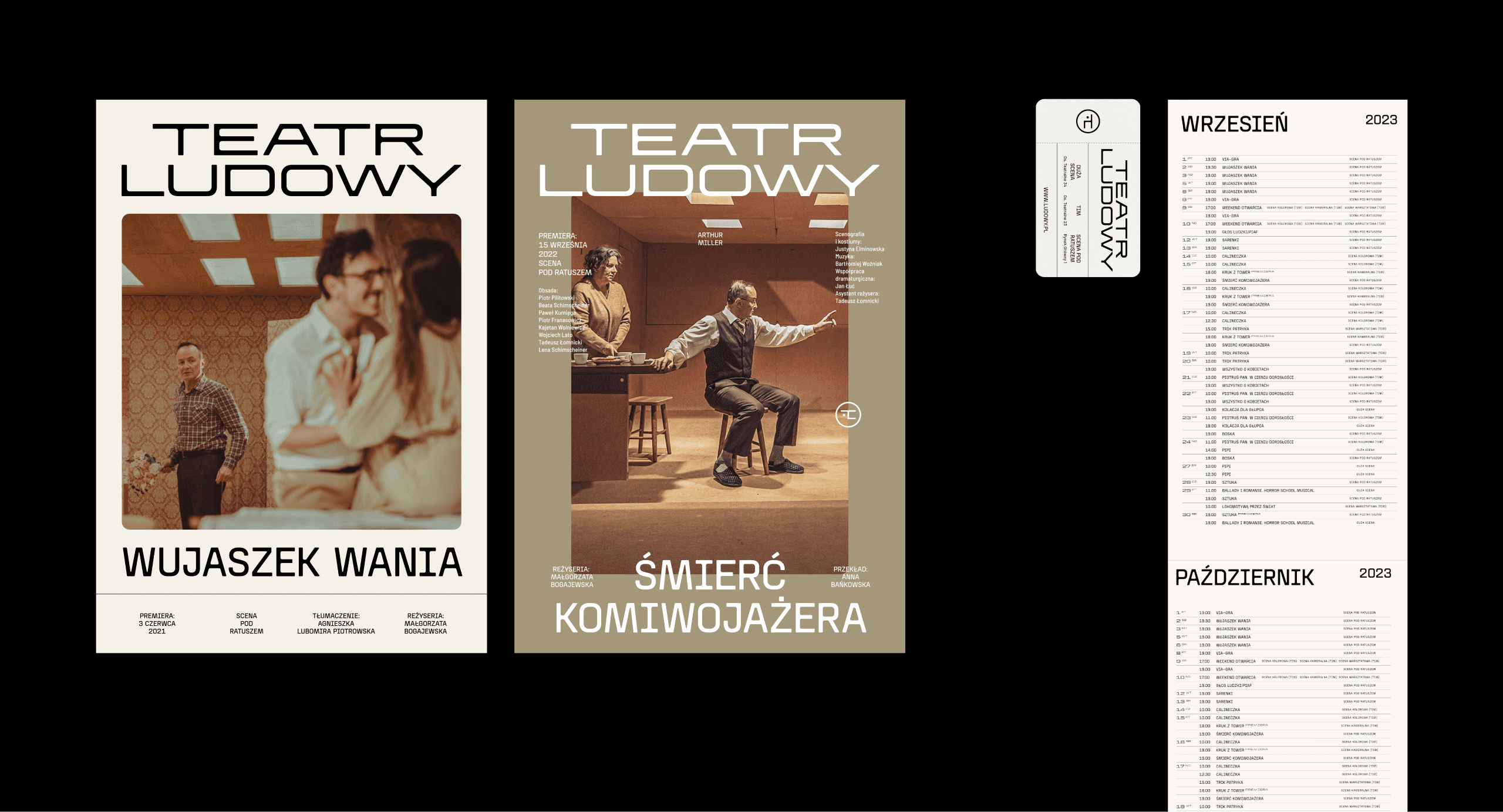


A shared identity for Teatr Ludowy and its new part, TIY, means mutual support for both institutions. TIY benefits from the recognition of Ludowy, while the main venue gains fresh energy from a space aimed at a younger audience.
A shared identity for Teatr Ludowy and its new part, TIY, means mutual support for both institutions. TIY benefits from the recognition of Ludowy, while the main venue gains fresh energy from a space aimed at a younger audience.
A shared identity for Teatr Ludowy and its new part, TIY, means mutual support for both institutions. TIY benefits from the recognition of Ludowy, while the main venue gains fresh energy from a space aimed at a younger audience.


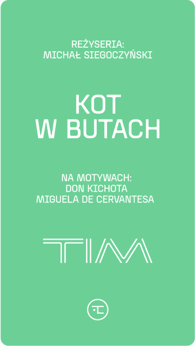
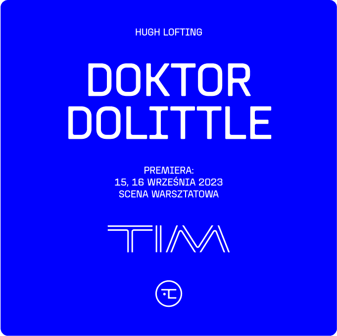
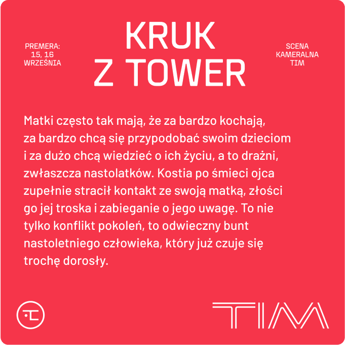


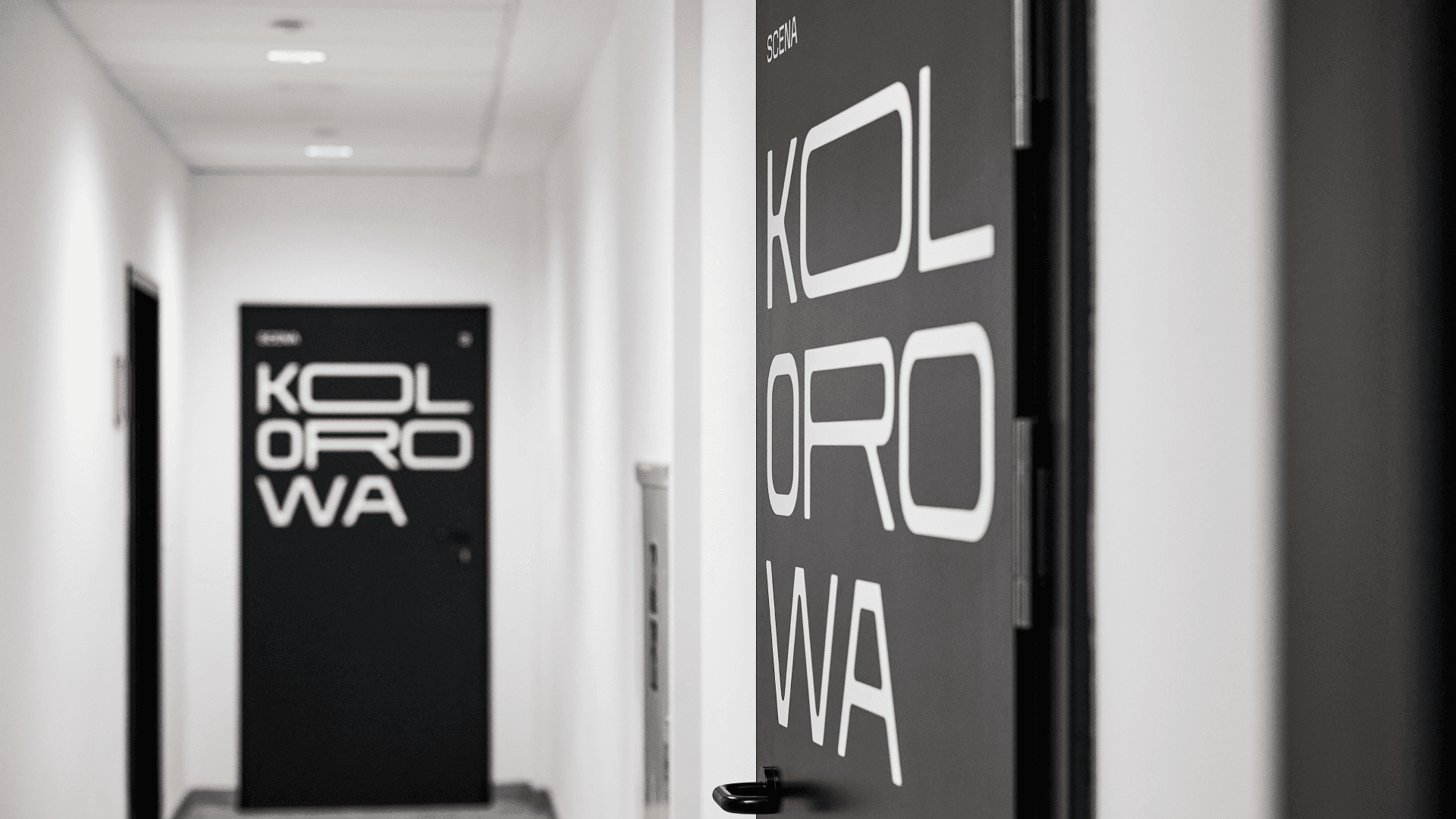
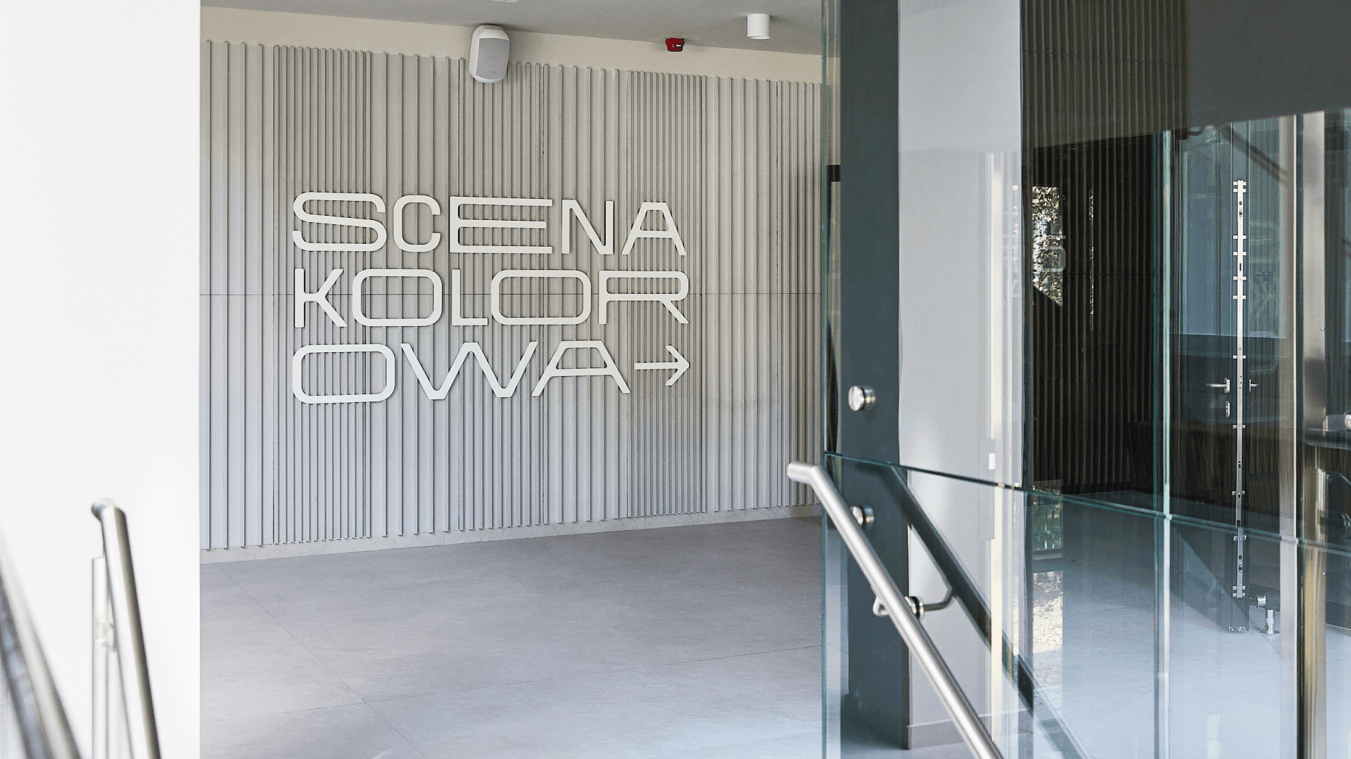
The spatial signage is also based on typography inspired by the neon sign. This way, the modern spaces of TIY maintain a connection to the history of Nowa Huta.
The spatial signage is also based on typography inspired by the neon sign. This way, the modern spaces of TIY maintain a connection to the history of Nowa Huta.
The spatial signage is also based on typography inspired by the neon sign. This way, the modern spaces of TIY maintain a connection to the history of Nowa Huta.


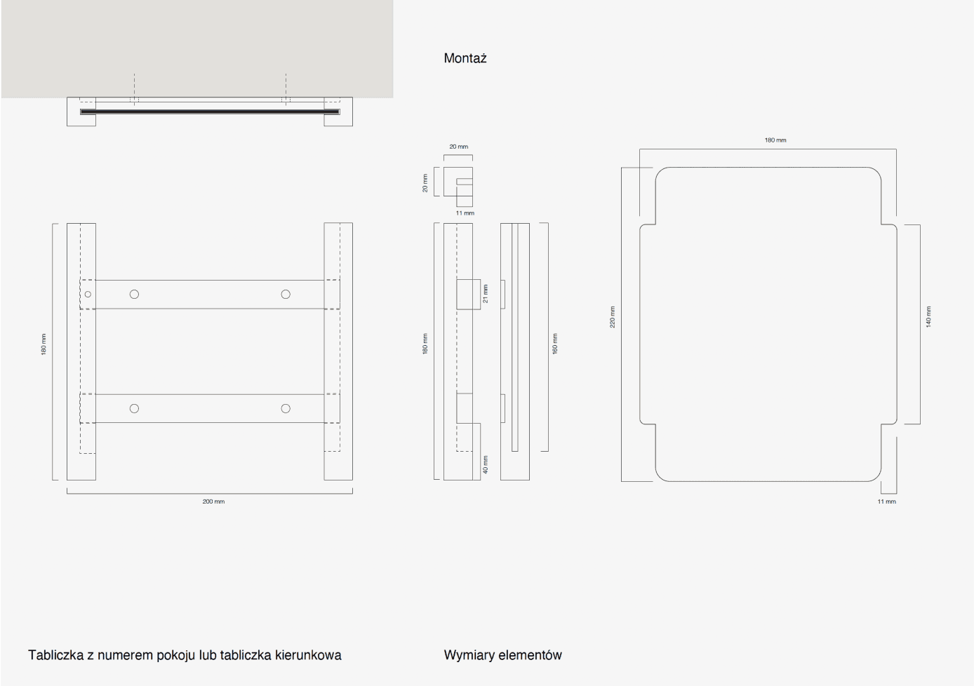


We also developed a system of interchangeable signs for the theater’s backstage areas and office spaces.
We also developed a system of interchangeable signs for the theater’s backstage areas and office spaces.
We also developed a system of interchangeable signs for the theater’s backstage areas and office spaces.


The following areas have been labeled: stages, theater halls, recording studio, archive, storage rooms, guest rooms, and floors.
The following areas have been labeled: stages, theater halls, recording studio, archive, storage rooms, guest rooms, and floors.
The following areas have been labeled: stages, theater halls, recording studio, archive, storage rooms, guest rooms, and floors.





2023
Design team:
Julek Wierzchowski, Patrycja Mola, Oksana Shmygol, Tomek Jurecki, Michał Róg, Oliwia Zypser, Mirek Kliś. Konsultacja typograficzna: Mateusz Machalski. Spoiwo Studio: Olga Sajnóg-Dąbek, Ewelina Ziółkowska - Jacyków
Theater team:
Małgorzata Bogajewska, Beata Strama
2023
Design team:
Julek Wierzchowski, Patrycja Mola, Oksana Shmygol, Tomek Jurecki, Michał Róg, Oliwia Zypser, Mirek Kliś. Konsultacja typograficzna: Mateusz Machalski. Spoiwo Studio: Olga Sajnóg-Dąbek, Ewelina Ziółkowska - Jacyków
Theater team:
Małgorzata Bogajewska, Beata Strama
2023
Design team:
Julek Wierzchowski, Patrycja Mola, Oksana Shmygol, Tomek Jurecki, Michał Róg, Oliwia Zypser, Mirek Kliś. Konsultacja typograficzna: Mateusz Machalski. Spoiwo Studio: Olga Sajnóg-Dąbek, Ewelina Ziółkowska - Jacyków
Theater team:
Małgorzata Bogajewska, Beata Strama

Let's talk about cooperation
© 2026 × studio otwarte
Let's talk about cooperation
© 2026 × studio otwarte
Let's talk about cooperation
© 2026 × studio otwarte