Visual identity of the city
Rybnik, like most Upper Silesian cities, is undergoing a transformation—from a mining and metallurgical town to a modern and friendly urban center. Part of these changes includes a new visual identity.
Visual identity of the city
Rybnik, like most Upper Silesian cities, is undergoing a transformation—from a mining and metallurgical town to a modern and friendly urban center. Part of these changes includes a new visual identity.
Visual identity of the city
Rybnik, like most Upper Silesian cities, is undergoing a transformation—from a mining and metallurgical town to a modern and friendly urban center. Part of these changes includes a new visual identity.


City rebranding, scope:
Brand strategy
Brand analysis and diagnosis
Brand architecture
Research, trends
Style and tone
Visual identity
City logo
Sub-brand signage system
Graphic elements
Illustrations
Icons, infographics
Motion design
Implementation
Templates for municipal prints
Signage templates
Social media framework
Material selection, technical preparation
Design system
Online brand manual
Website
User Experience Design
Web Design
Front-end development
Back-end development
City rebranding, scope:
Brand strategy
Brand analysis and diagnosis
Brand architecture
Research, trends
Style and tone
Visual identity
City logo
Sub-brand signage system
Graphic elements
Illustrations
Icons, infographics
Motion design
Implementation
Templates for municipal prints
Signage templates
Social media framework
Material selection, technical preparation
Design system
Online brand manual
Website
User Experience Design
Web Design
Front-end development
Back-end development
City rebranding, scope:
Brand strategy
+
Visual identity
+
Implementation
+
Website
+
Historically, the city was famous for fish farming, hence the image of a pike in the municipal coat of arms. However, the way it was drawn in the coat of arms made it impossible to simplify and use on modern media. Therefore, a new version had to be developed for the new visual identity. The newly drawn, simplified “heraldic logo” with thicker lines can now be freely scaled and placed on various substrates.
Historically, the city was famous for fish farming, hence the image of a pike in the municipal coat of arms. However, the way it was drawn in the coat of arms made it impossible to simplify and use on modern media. Therefore, a new version had to be developed for the new visual identity. The newly drawn, simplified “heraldic logo” with thicker lines can now be freely scaled and placed on various substrates.
Historically, the city was famous for fish farming, hence the image of a pike in the municipal coat of arms. However, the way it was drawn in the coat of arms made it impossible to simplify and use on modern media. Therefore, a new version had to be developed for the new visual identity. The newly drawn, simplified “heraldic logo” with thicker lines can now be freely scaled and placed on various substrates.


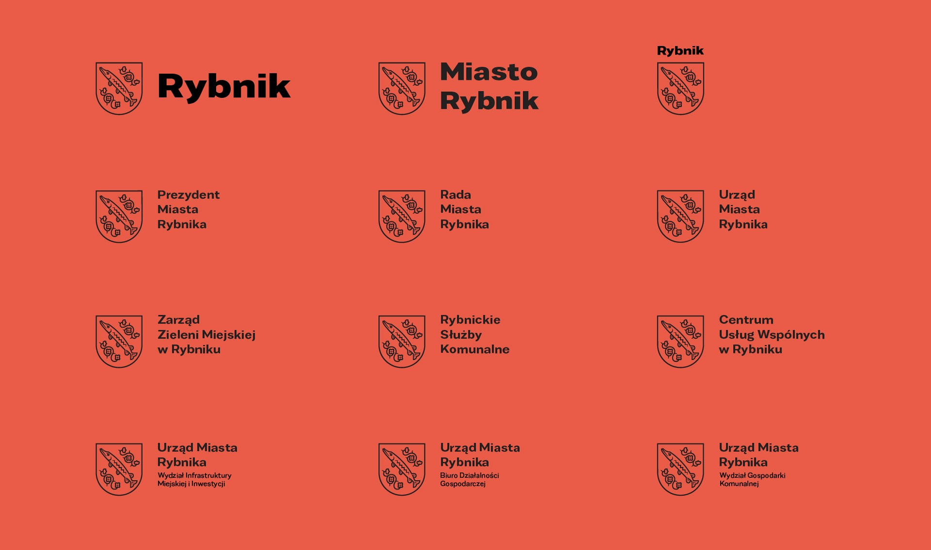
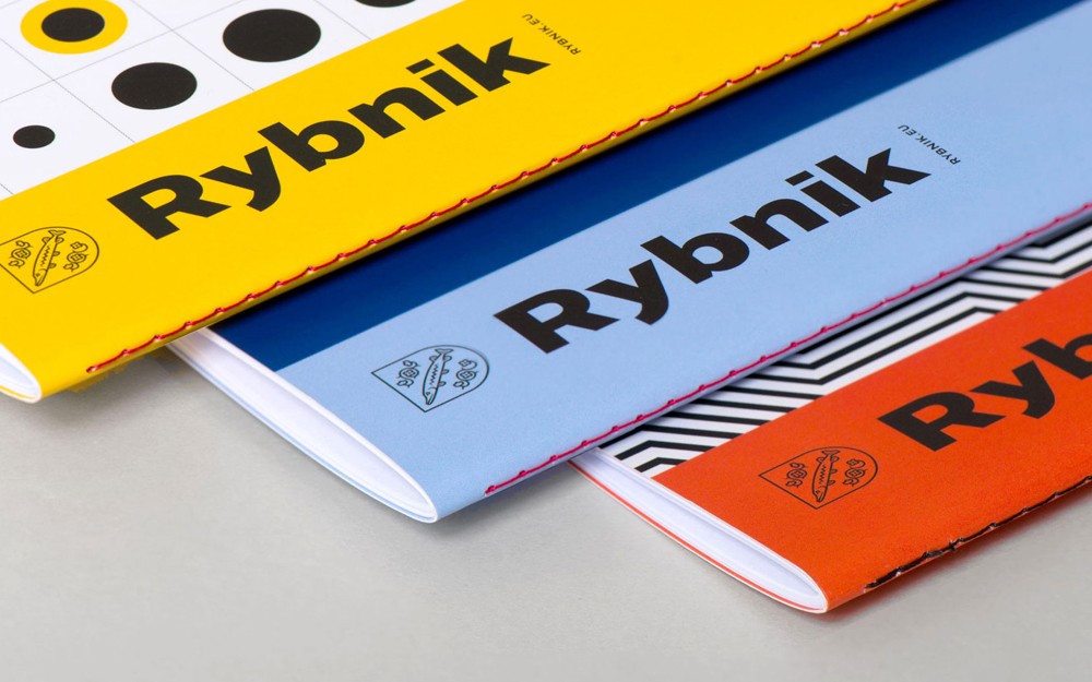
Along with the logo, we developed a modular grid-based signage system for all municipal institutions and departments of the City Hall. The typeface used in the logotype and municipal materials is Favela, created by Polish designer Mateusz Machalski. For the key visual we complemented the blue from the municipal coat of arms with additional “Silesian” colors: black, red, and yellow.
Along with the logo, we developed a modular grid-based signage system for all municipal institutions and departments of the City Hall. The typeface used in the logotype and municipal materials is Favela, created by Polish designer Mateusz Machalski. For the key visual we complemented the blue from the municipal coat of arms with additional “Silesian” colors: black, red, and yellow.
Along with the logo, we developed a modular grid-based signage system for all municipal institutions and departments of the City Hall. The typeface used in the logotype and municipal materials is Favela, created by Polish designer Mateusz Machalski. For the key visual we complemented the blue from the municipal coat of arms with additional “Silesian” colors: black, red, and yellow.



The leitmotif of Rybnik’s visual identity system is illustrations inspired by the 1920s stained glass windows in the council chamber of the Rybnik town hall. The figures in the stained glass windows represent allegories of fields traditionally associated with Rybnik: metallurgy, industry and trade, the urban community, mining, and agriculture.
The leitmotif of Rybnik’s visual identity system is illustrations inspired by the 1920s stained glass windows in the council chamber of the Rybnik town hall. The figures in the stained glass windows represent allegories of fields traditionally associated with Rybnik: metallurgy, industry and trade, the urban community, mining, and agriculture.
The leitmotif of Rybnik’s visual identity system is illustrations inspired by the 1920s stained glass windows in the council chamber of the Rybnik town hall. The figures in the stained glass windows represent allegories of fields traditionally associated with Rybnik: metallurgy, industry and trade, the urban community, mining, and agriculture.


Rybnik’s new visual identity includes the graphic design of municipal documents, publications, and informational and promotional materials—both printed and electronic. This includes official stationery and document formats, templates for municipal posters, notices, flyers, and information booklets, as well as the city’s website. Consistent signage will cover municipal buildings, the vehicle fleet, including public transport vehicles, as well as gadgets, gifts, and other promotional materials.
Rybnik’s new visual identity includes the graphic design of municipal documents, publications, and informational and promotional materials—both printed and electronic. This includes official stationery and document formats, templates for municipal posters, notices, flyers, and information booklets, as well as the city’s website. Consistent signage will cover municipal buildings, the vehicle fleet, including public transport vehicles, as well as gadgets, gifts, and other promotional materials.
Rybnik’s new visual identity includes the graphic design of municipal documents, publications, and informational and promotional materials—both printed and electronic. This includes official stationery and document formats, templates for municipal posters, notices, flyers, and information booklets, as well as the city’s website. Consistent signage will cover municipal buildings, the vehicle fleet, including public transport vehicles, as well as gadgets, gifts, and other promotional materials.



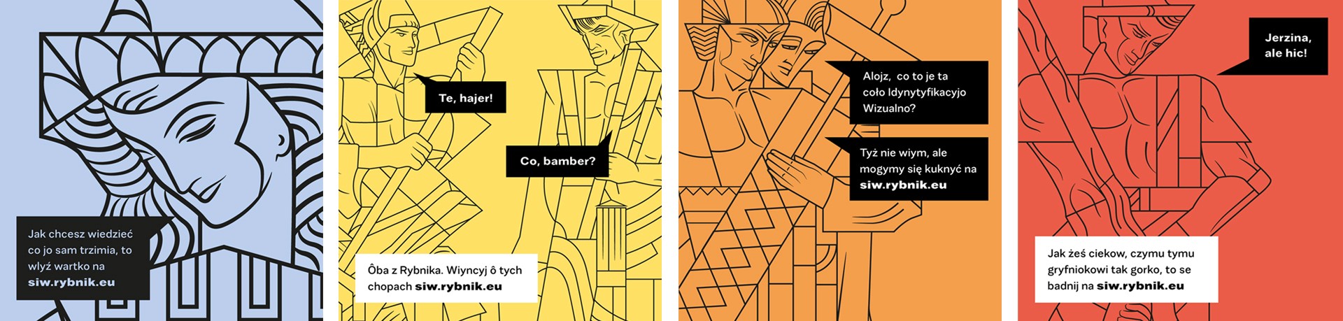


The culmination of the work is the online Brand Manual at siw.rybnik.eu, which serves as both a presentation and a comprehensive guide for applying the visual identity system, as well as a constantly updated database of system components.
The culmination of the work is the online Brand Manual at siw.rybnik.eu, which serves as both a presentation and a comprehensive guide for applying the visual identity system, as well as a constantly updated database of system components.
The culmination of the work is the online Brand Manual at siw.rybnik.eu, which serves as both a presentation and a comprehensive guide for applying the visual identity system, as well as a constantly updated database of system components.
2018-2019
Design & Art Direction::
Marcin Wolny, Oksana Shmygol, Tomasz Jurecki, Paulina Duźniak
Font author:
Mateusz Machalski
Manual online:
Maciej Mach, Jan Drozd, Mirek Kliś
Client side team:
Robert Cebula, Kamil Styga
2018-2019
Design & Art Direction::
Marcin Wolny, Oksana Shmygol, Tomasz Jurecki, Paulina Duźniak
Font author:
Mateusz Machalski
Manual online:
Maciej Mach, Jan Drozd, Mirek Kliś
Client side team:
Robert Cebula, Kamil Styga
2018-2019
Design & Art Direction::
Marcin Wolny, Oksana Shmygol, Tomasz Jurecki, Paulina Duźniak
Font author:
Mateusz Machalski
Manual online:
Maciej Mach, Jan Drozd, Mirek Kliś
Client side team:
Robert Cebula, Kamil Styga

Let's talk about cooperation
© 2026 × studio otwarte
Let's talk about cooperation
© 2026 × studio otwarte
Let's talk about cooperation
© 2026 × studio otwarte