Żubrówka Czarna - polska kultowa marka
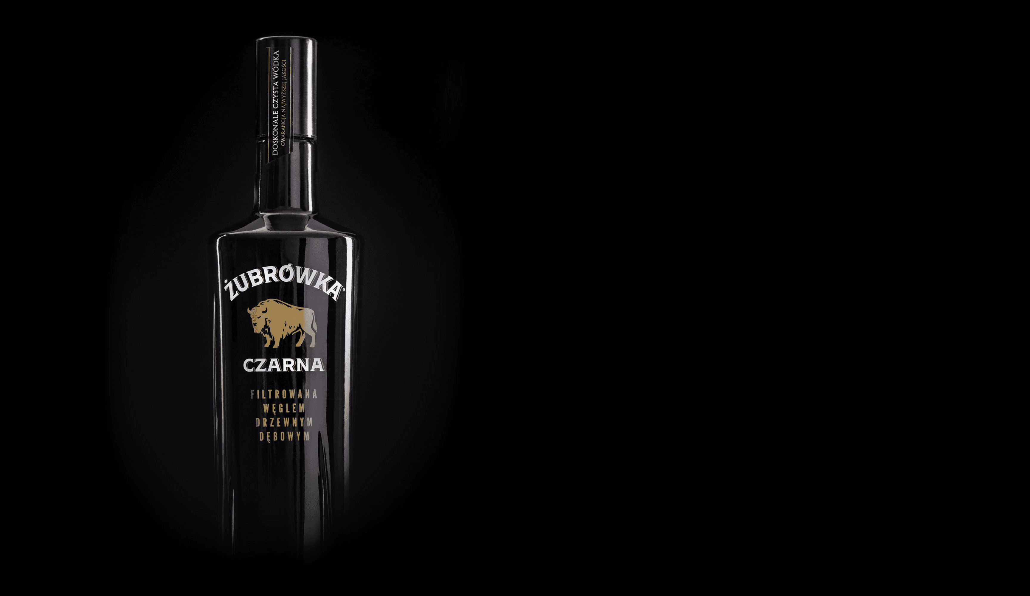
Premium edition of this iconinc brand: the only vodka subjected to a unique charcoal filtration process in Poland.
Żubrówka Czarna - polska kultowa marka
Premium edition of this iconinc brand: the only vodka subjected to a unique charcoal filtration process in Poland.
Żubrówka Czarna - polska kultowa marka
Premium edition of this iconinc brand: the only vodka subjected to a unique charcoal filtration process in Poland.
Rebranding:
Strategy
Category analysis
Desk research analysis
Visual identity
Logo
Key visual
Illustrations
Icons
Packaging
Graphic concept
Preparation and supervision of production
Implementation
Copywriting
Technical preparation
Communication framework templates
Brand manual
Rebranding:
Strategy
+
Visual identity
+
Packaging
+
Implementation
+
Rebranding:
Strategy
Category analysis
Desk research analysis
Visual identity
Logo
Key visual
Illustrations
Icons
Packaging
Graphic concept
Preparation and supervision of production
Implementation
Copywriting
Technical preparation
Communication framework templates
Brand manual
We were invited to carry out a rebranding that includes a new drawing of the bison, a logotype, and a refresh of the typography on the bottle. The visual language – black, gold, and white, along with subtle enhancements – clearly positions the product in the premium category.
We were invited to carry out a rebranding that includes a new drawing of the bison, a logotype, and a refresh of the typography on the bottle. The visual language – black, gold, and white, along with subtle enhancements – clearly positions the product in the premium category.
We were invited to carry out a rebranding that includes a new drawing of the bison, a logotype, and a refresh of the typography on the bottle. The visual language – black, gold, and white, along with subtle enhancements – clearly positions the product in the premium category.


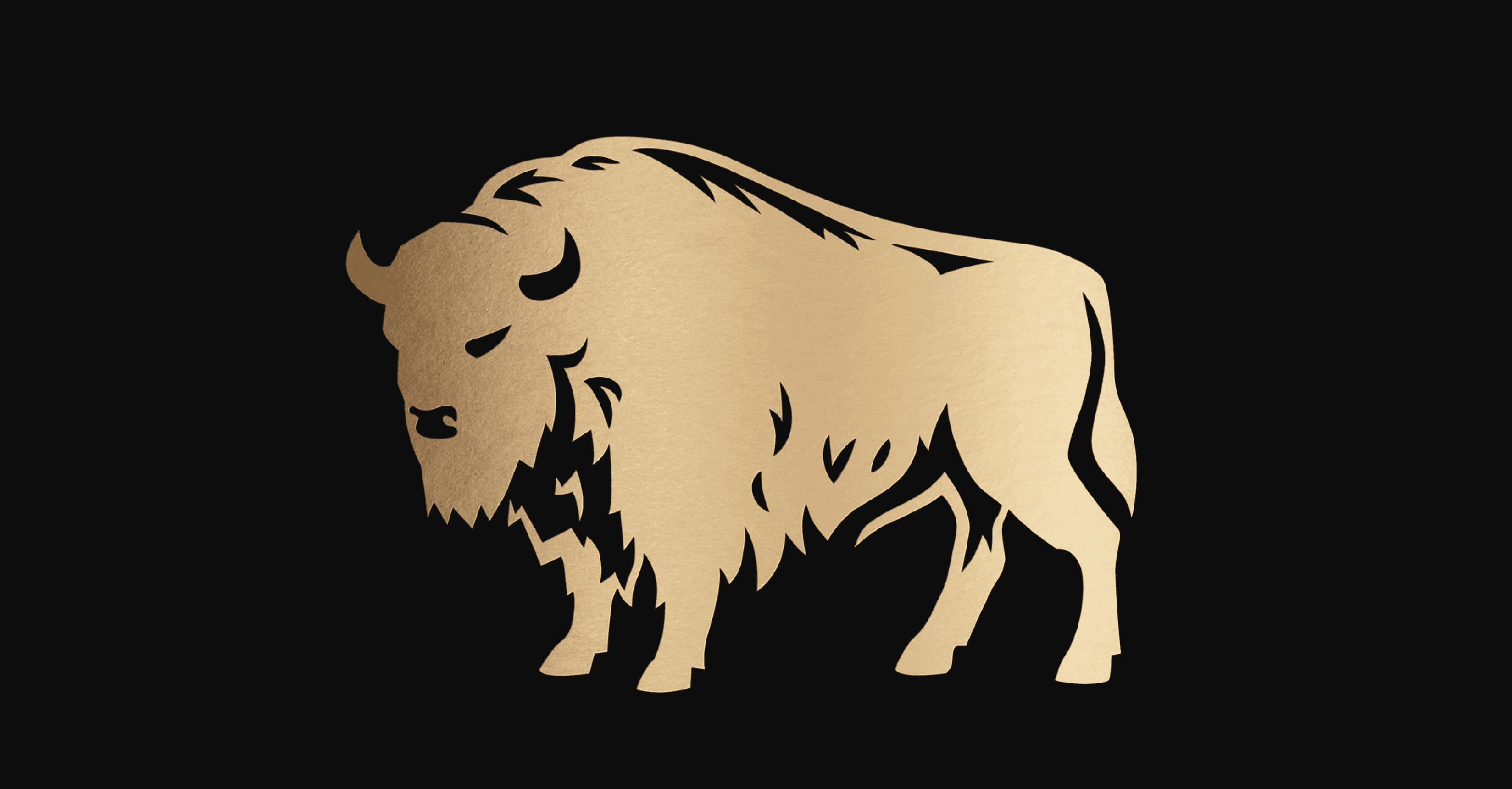
In the new drawing, the most recognizable features of the previous symbol are preserved: the pose, shape, and proportions. However, many details have been refined. The stance has been improved, with the bison now standing more firmly on the ground, exuding strength and dignity. The drawing is more distinct, with stronger lines and clearer details. Special simplified versions have also been created to ensure precise control of the drawing’s appearance when scaled down or printed using specific methods.
In the new drawing, the most recognizable features of the previous symbol are preserved: the pose, shape, and proportions. However, many details have been refined. The stance has been improved, with the bison now standing more firmly on the ground, exuding strength and dignity. The drawing is more distinct, with stronger lines and clearer details. Special simplified versions have also been created to ensure precise control of the drawing’s appearance when scaled down or printed using specific methods.
In the new drawing, the most recognizable features of the previous symbol are preserved: the pose, shape, and proportions. However, many details have been refined. The stance has been improved, with the bison now standing more firmly on the ground, exuding strength and dignity. The drawing is more distinct, with stronger lines and clearer details. Special simplified versions have also been created to ensure precise control of the drawing’s appearance when scaled down or printed using specific methods.
Żubrówka Czarna is based on the Shackleton typeface, modified to ensure that the text on the arc is legible while maintaining its distinctive details.
Żubrówka Czarna is based on the Shackleton typeface, modified to ensure that the text on the arc is legible while maintaining its distinctive details.
Żubrówka Czarna is based on the Shackleton typeface, modified to ensure that the text on the arc is legible while maintaining its distinctive details.


Additionally, the packaging features the narrow, sans-serif typeface League Gothic, which contrasts with the wide, serif Shackleton used in the logotype. This typeface is used for the product’s flavor variations and in brand communications, such as short titles and headings. Other distinctive typefaces include Tabac G2 and Dejavu Serif, which are suitable for headings and longer texts.
Additionally, the packaging features the narrow, sans-serif typeface League Gothic, which contrasts with the wide, serif Shackleton used in the logotype. This typeface is used for the product’s flavor variations and in brand communications, such as short titles and headings. Other distinctive typefaces include Tabac G2 and Dejavu Serif, which are suitable for headings and longer texts.


The flavor of Żubrówka Czarna Leżakowana is a blend of water from the Białowieża Forest springs, premium Polish wheat spirit, and a unique oak charcoal filtration process. Its final character is defined by the aging process in barrels made from the finest types of wood, which impart their aroma.
The flavor of Żubrówka Czarna Leżakowana is a blend of water from the Białowieża Forest springs, premium Polish wheat spirit, and a unique oak charcoal filtration process. Its final character is defined by the aging process in barrels made from the finest types of wood, which impart their aroma.
The flavor of Żubrówka Czarna Leżakowana is a blend of water from the Białowieża Forest springs, premium Polish wheat spirit, and a unique oak charcoal filtration process. Its final character is defined by the aging process in barrels made from the finest types of wood, which impart their aroma.

Żubrówka is a legendary Polish vodka, known and appreciated worldwide. We were asked to design packaging for new flavor variants – aged in ash or oak barrels. Our task was to emphasize the natural origin of the ingredients and the craft nature of the product.
Żubrówka is a legendary Polish vodka, known and appreciated worldwide. We were asked to design packaging for new flavor variants – aged in ash or oak barrels. Our task was to emphasize the natural origin of the ingredients and the craft nature of the product.
Żubrówka is a legendary Polish vodka, known and appreciated worldwide. We were asked to design packaging for new flavor variants – aged in ash or oak barrels. Our task was to emphasize the natural origin of the ingredients and the craft nature of the product.
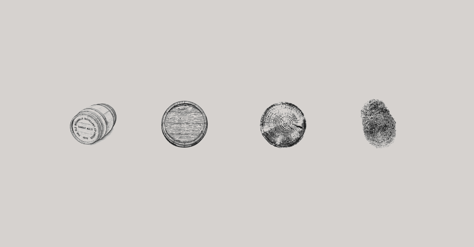
The wood grain motif on the bottle references the careful selection of raw materials and the vodka aging process in wooden barrels. The tactile texture of the print simultaneously evokes the image of a fingerprint – a mark of human craftsmanship.
The wood grain motif on the bottle references the careful selection of raw materials and the vodka aging process in wooden barrels. The tactile texture of the print simultaneously evokes the image of a fingerprint – a mark of human craftsmanship.
The wood grain motif on the bottle references the careful selection of raw materials and the vodka aging process in wooden barrels. The tactile texture of the print simultaneously evokes the image of a fingerprint – a mark of human craftsmanship.


The flavor of Żubrówka Czarna Leżakowana is a blend of water from the Białowieża Forest springs, premium Polish wheat spirit, and a unique oak charcoal filtration process. Its final character is defined by the aging process in barrels made from the finest types of wood, which impart their aroma.
The flavor of Żubrówka Czarna Leżakowana is a blend of water from the Białowieża Forest springs, premium Polish wheat spirit, and a unique oak charcoal filtration process. Its final character is defined by the aging process in barrels made from the finest types of wood, which impart their aroma.
The flavor of Żubrówka Czarna Leżakowana is a blend of water from the Białowieża Forest springs, premium Polish wheat spirit, and a unique oak charcoal filtration process. Its final character is defined by the aging process in barrels made from the finest types of wood, which impart their aroma.

2020
Design team:
Julek Wierzchowski, Marcin Wolny, Paulina Duźniak, Packshot: Mateusz Torbus
Client representative:
Monika Grudniak
2020
Design team:
Julek Wierzchowski, Marcin Wolny, Paulina Duźniak, Packshot: Mateusz Torbus
Client representative:
Monika Grudniak
2020
Design team:
Julek Wierzchowski, Marcin Wolny, Paulina Duźniak, Packshot: Mateusz Torbus
Client representative:
Monika Grudniak

Let's talk about cooperation
© 2026 × studio otwarte
Let's talk about cooperation
© 2026 × studio otwarte
Let's talk about cooperation
© 2026 × studio otwarte